Even for the graphics that served as more of a one-off, my goal for every assignment was to create a visually engaging graphic that was difficult to scroll past on the user's main feed. I also made sure utilize the REACH brand typefaces and colors so that it was identifiable as a REACH Project graphic.
SINGLE PAGE GRAPHICS
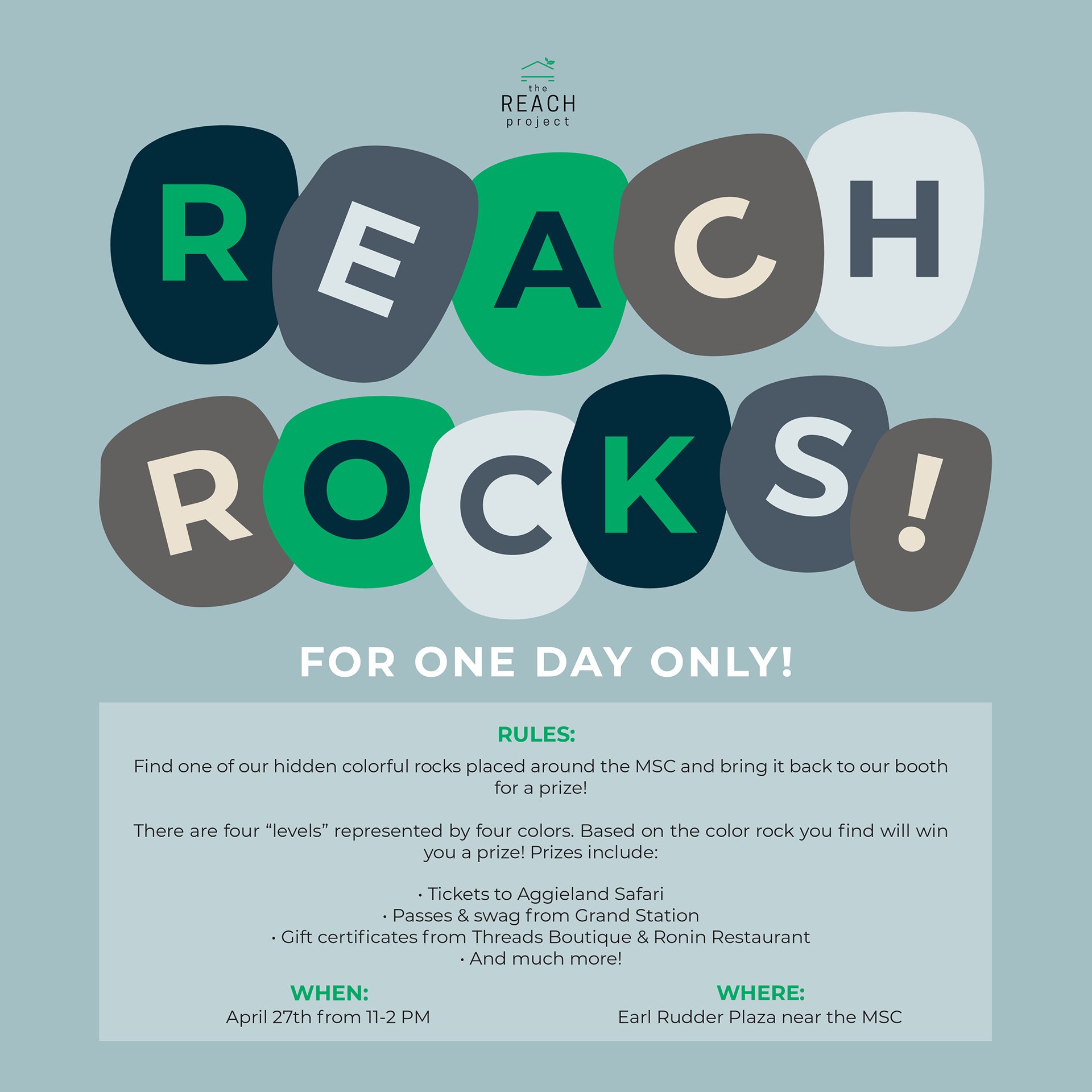
This is a graphic for one of REACH's one-off events where we hid rocks around campus in exchange for prizes. Instead of using a regular title, I wanted to stick the theme of rocks by creatively implementing them into the title. Each letter looks like it has been painted onto a rock.
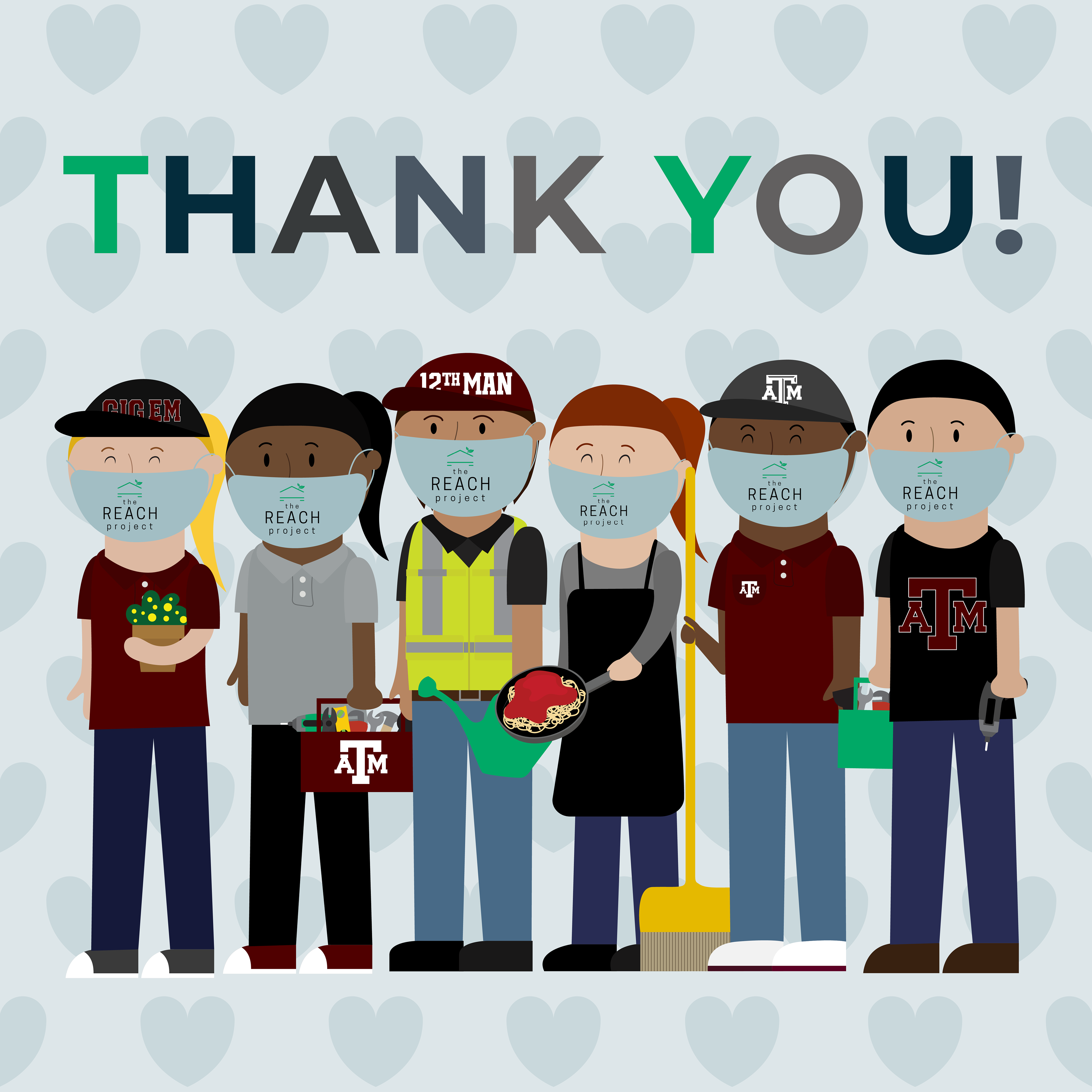
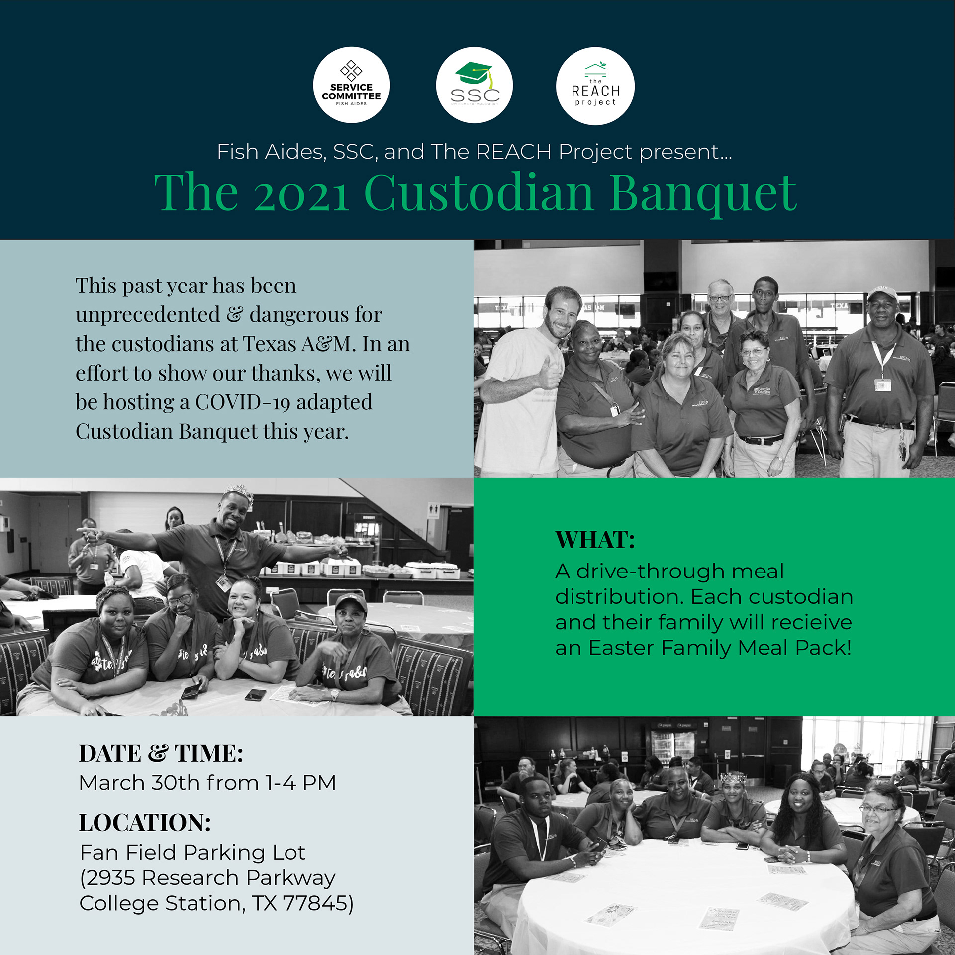
This was the final graphic for the Spring 2021 semester before everyone went home for the summer. It is a post thanking our essential workers for all that their hard work keeping the school safe and clean during a global pandemic.
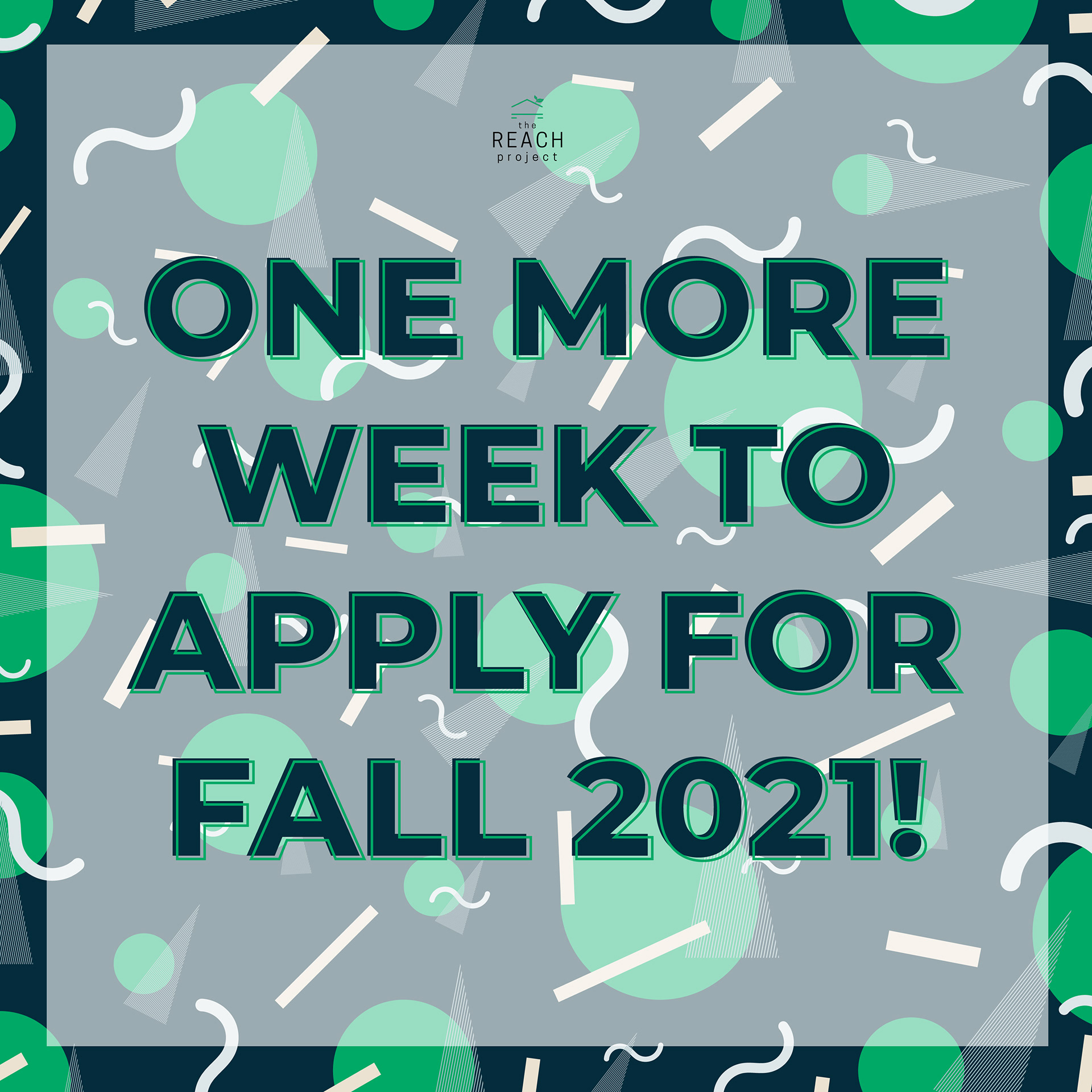
This is one of the ads we put up on our Instagram and Facebook to recruit new interns for the Fall 2021 semester. I decided on this particular 90's-inspired pattern to catch the eye of our viewers and also to convey that interning for The REACH Project is fun and worthwhile experience.
MULTI-PAGE GRAPHICS
This is initial ad we put up on our Instagram and Facebook to recruit new interns for the Fall 2021 semester. I decided on this particular 90's-inspired pattern to catch the eye of our viewers and also to convey that interning for The REACH Project is fun and exciting experience.
This is the schedule for our one and only REACH Week event. This was the first time I utilized the multi-colored letters. I made this design choice in order to convey to our viewers that this would be a fun event.