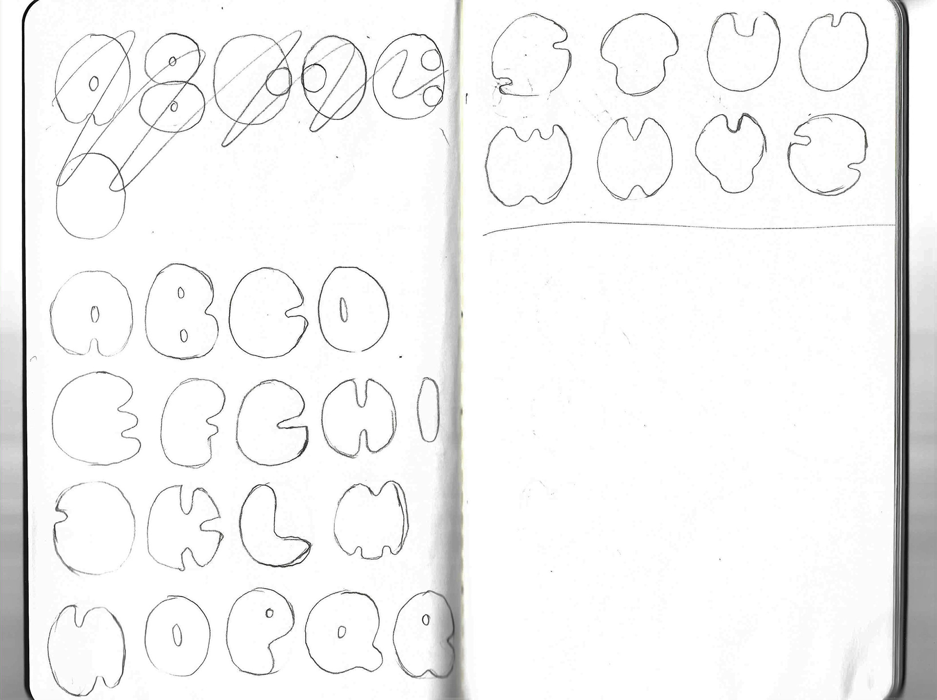
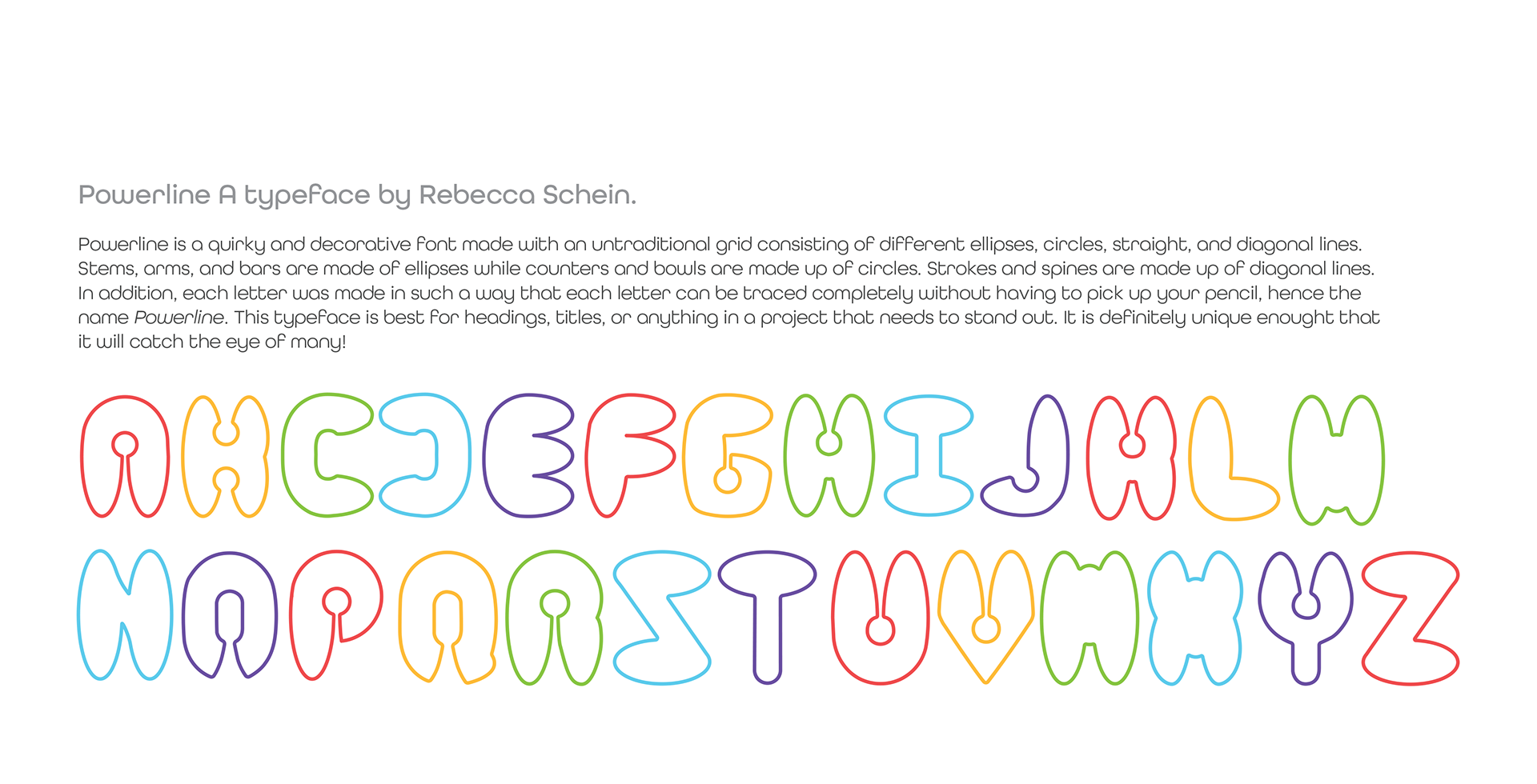
This project was the first in my Graphic Design II class in my last semester of undergrad. For Part One, we were tasked with designing our own typeface. I was particularly intrigued by the quirkiness and endless possibilities of bubble lettering. I also really like neon lights and how the glass material is bent in such a way it forms one cohesive line. I wanted to capture those two aspects in my own typeface.
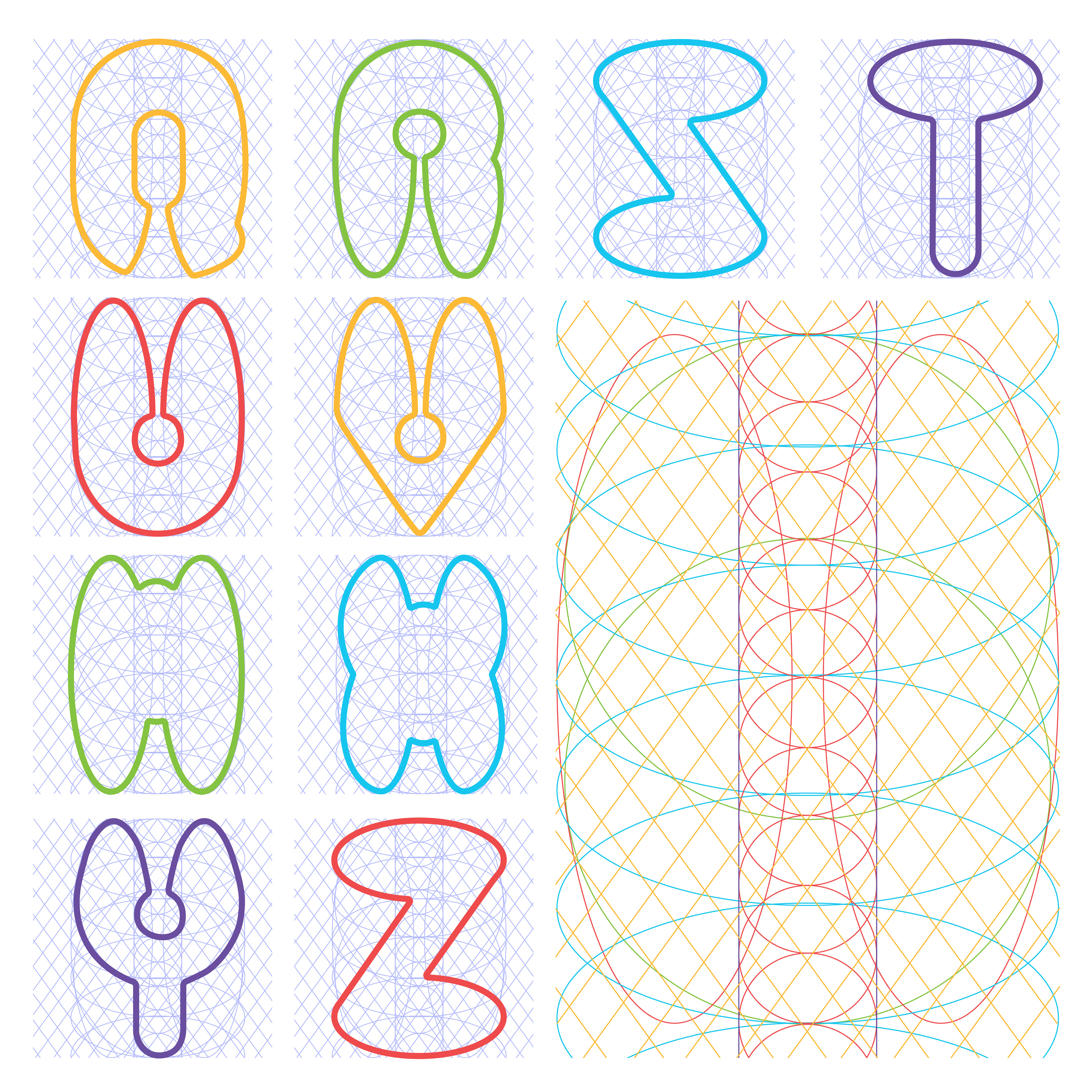
The main component of my typeface is that every letter can be traced without picking up your pencil and without having to re-trace over any part, hence why I named my type, "Powerline". The secondary component is the distinct "key holes".
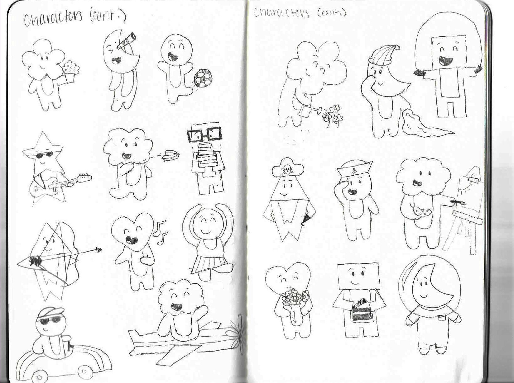
Part Two of the project required me to take my developed typeface, design a poster with it and illustrations of my choice, and then find a way to incorporate it in my environment in any way I felt best. Because of it's distinct personality I decided that my poster have the theme of empowering others to be themselves. At first I struggled with this concept because I wasn't quite sure how I wanted to depict that in the illustrations, but then after some random sketching I ended up fully developing some quirky characters engaging in various activities/interests.
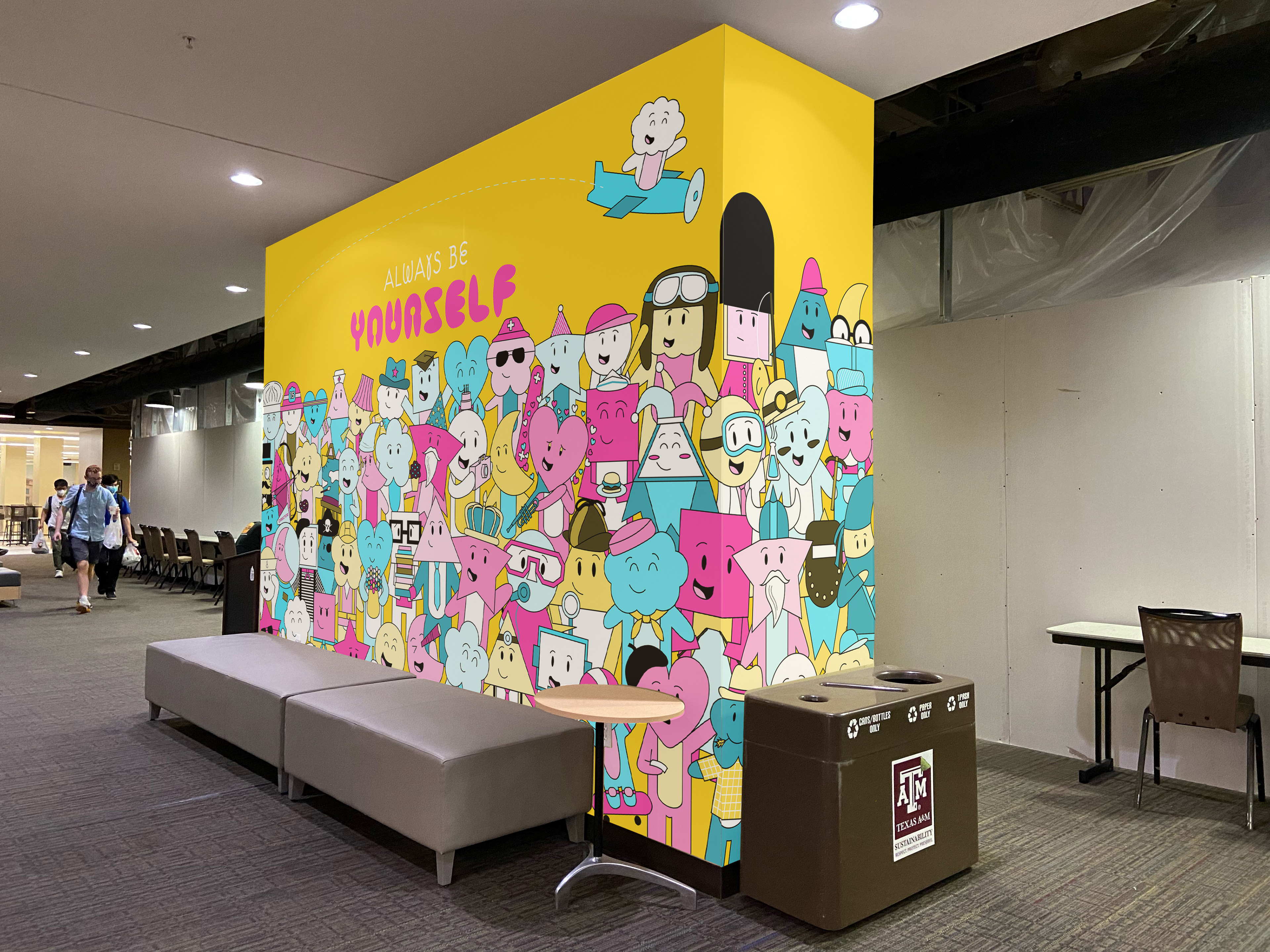
Finally, I decided to convert my poster into a mural which was then to be hypothetically placed in the underground common space at the Memorial Student Center at Texas A&M. It is where students hang out, eat, and play games. I thought that was the most appropriate place to put such a colorful and fun mural.
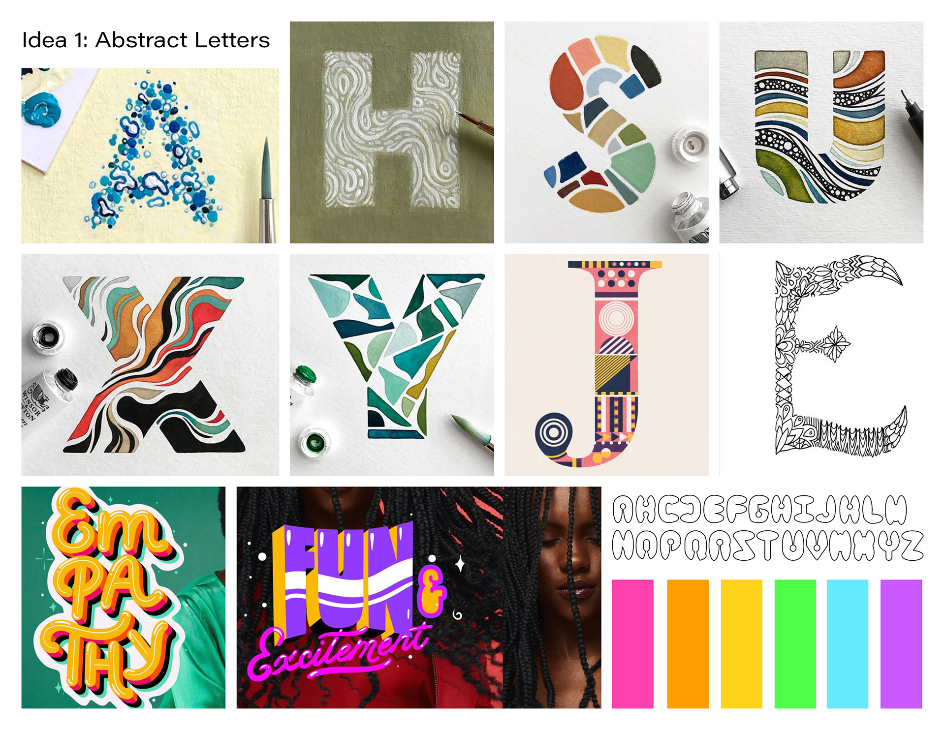
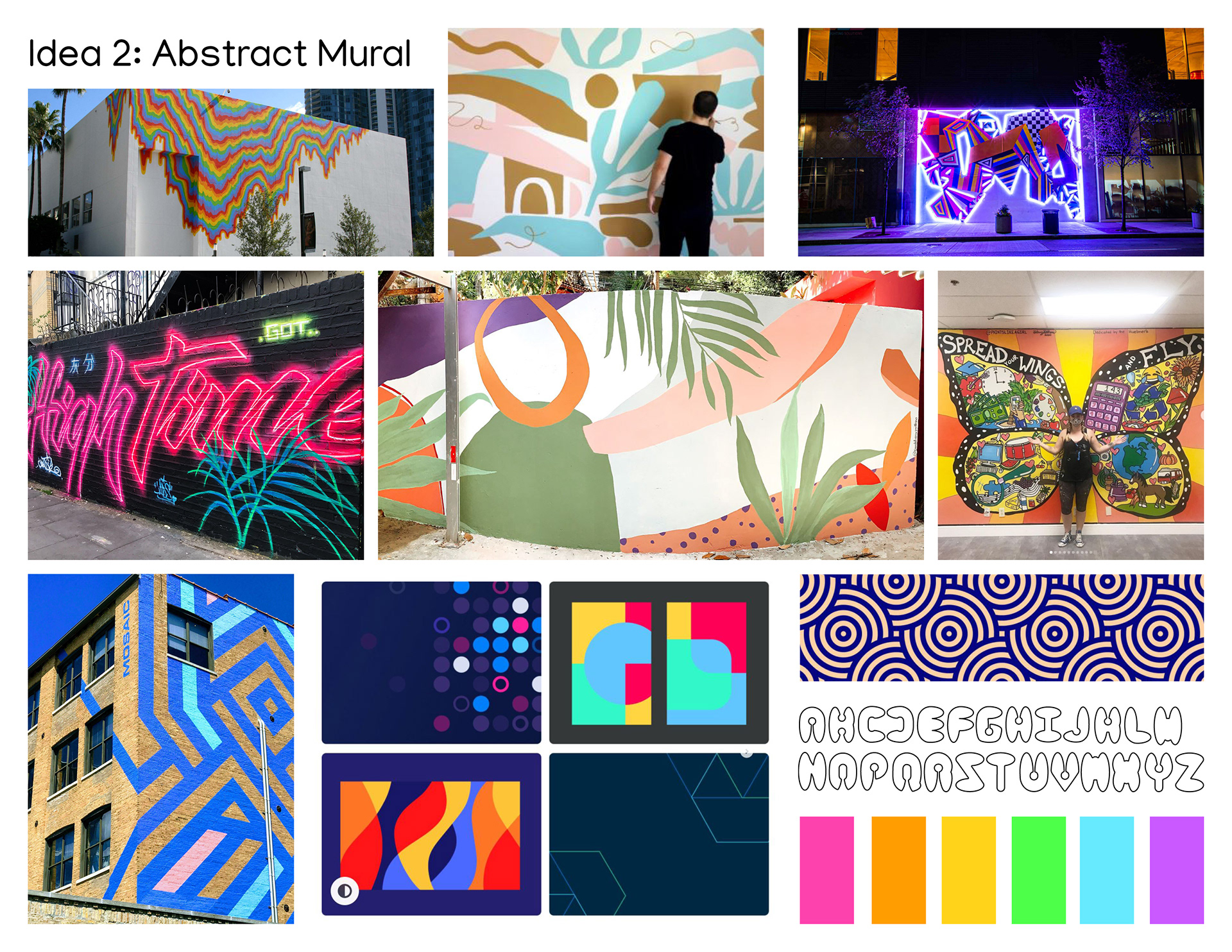
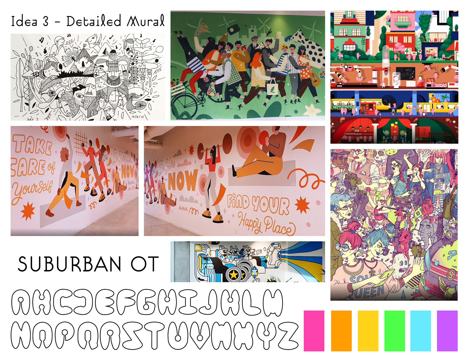
MOODBOARD + PRELIMINARY SKETCHES FOR TYPOGRAPHIC DESIGN (PART 1)

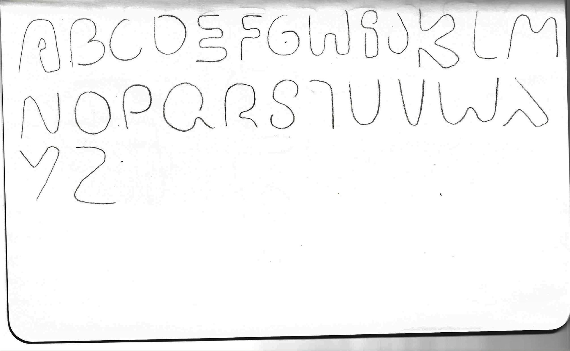
Idea 1
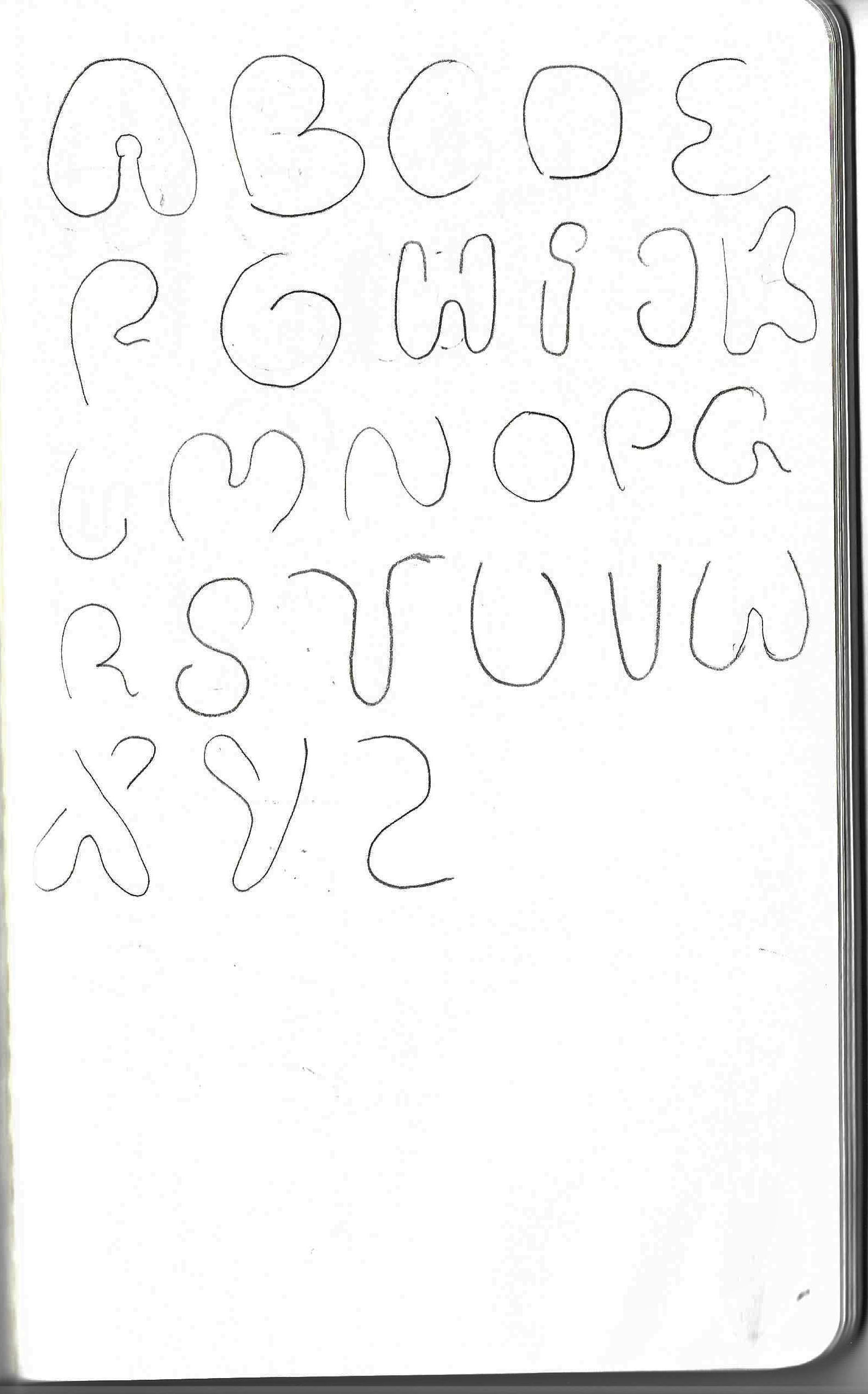
Idea 1, reworked
Idea 2
FINAL TYPOGRAPHIC GRID

MOODBOARD PRELIMINARY SKETCHES FOR ENVIRONMENTAL DESIGN (PART 2)

FINAL DELIVERABLES
Official typeface
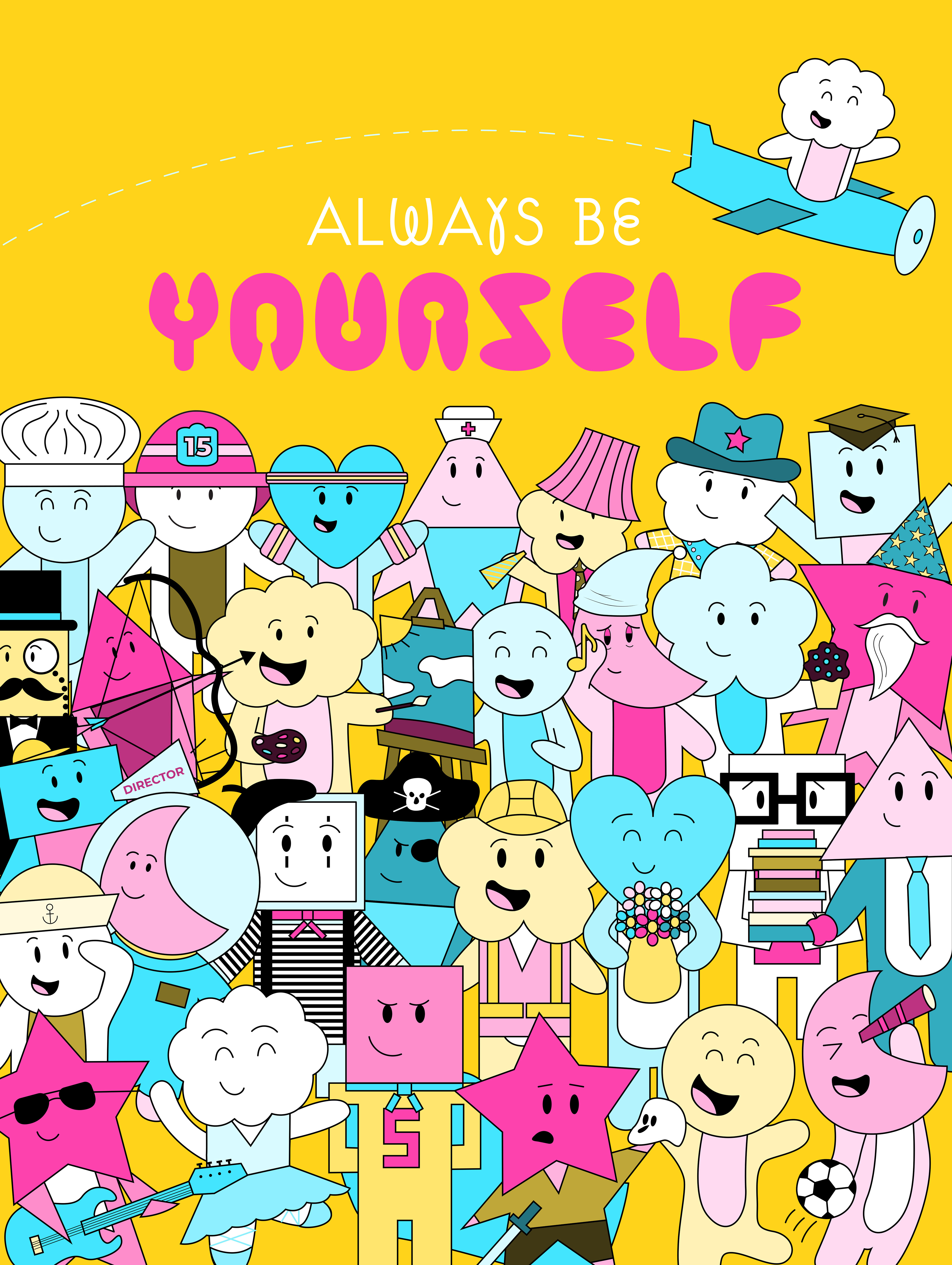
Poster (with Suburban OT typeface in white)
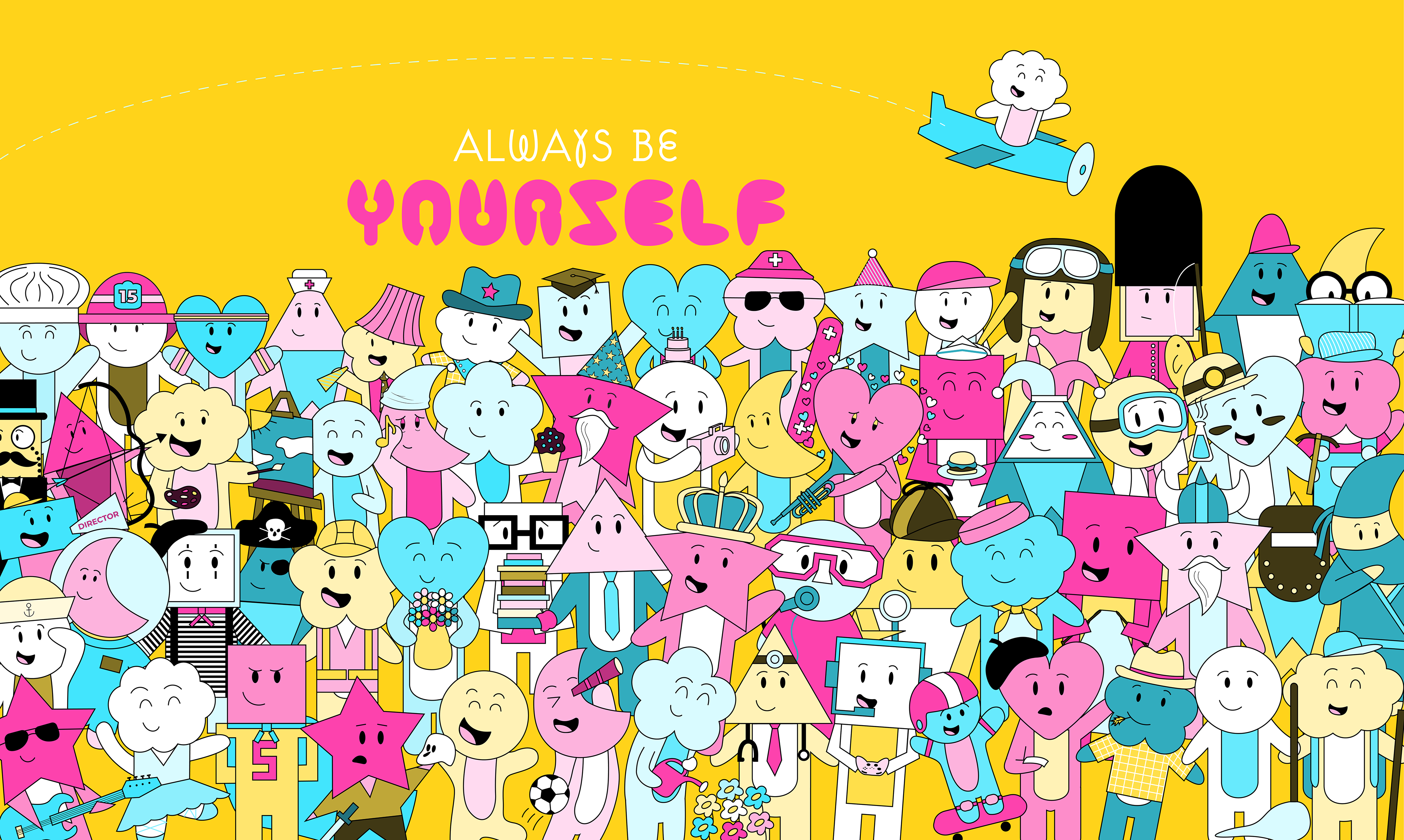
Mural